The Story Of An Artist: Victor Gastelum
Interview with Victor Gastelum.
“Victor is the fifth Beatle, he is the silent one that no one really ever sees.”
—Joey Burns, Calexico
Words: Craig Carry, Artwork: Victor Gastelum
Original Post (with artwork): http://fracturedair.com/2014/01/29/the-story-of-an-artist-victor-gastel…
“Love the run but not the race
All alone in a silent way
World drifts in and the world’s a stranger”
—‘Quattro (World Drifts In)’, Calexico
In an attempt to write the story of the Long Beach California-based artist Victor Gastelum, it is tempting to simultaneously write the story of Tucson Arizona’s beloved sons Calexico. For, across the band’s vast body of sprawling, timeless work — encompassing a string of studio albums, tour records, a plethora of EP’s, soundtrack scores and a multitude of collaborative works — the artwork of Gastelum’s adorn some of the most precious of Calexico’s records since their inception in 1996, following core-duo Joey Burns and John Convertino’s previous spell as rhythm-section to Howe Gelb’s Giant Sand; another one of Tucson’s most revered bands. Victor Gastelum, a native of Southern California, would provide the artwork for one of the band’s earliest releases, “Spark/The Ride”, a single put out in 1996, prior to the band’s full-length debut “Spoke” (released by Quarterstick Records in the following year). The music (both written by Burns) can be perfectly summed up by the description found inside, set in all-lowercase, on a black-and-white postcard-sized insert:
“two western gems from two southwestern gents. joey and john from giant sand moonlighting in the tucson sun.”
The stencil artwork on “Spark/The Ride” is vintage Gastelum, featuring a young man and his low-ride car in a striking 2-color blue and gold combination. The image — like his later work — is isolated on a white background like a flash-aided Richard Avedon portrait, highlighting the iconic feel of the image in its minimal setting. The artwork would be the first of many in a near-symbiotic journey between Gastelum and Calexico over the next couple of decades when Gastelum would go on to produce the artwork for the band’s studio albums “The Black Light” (1998), “Hot Rail” (2000), “Feast Of Wire” (2003), the tour record “Tool Box” (2007), “Carried To Dust” (2008), the limited edition box-set — comprising the band’s tour-only releases — “Road Atlas 1998-2011” (2011) as well as a host of various singles and EP’s (including “Stray”, “The Ride (Pt. 2)”, “Ballad Of Cable Hogue”, “Crystal Frontier”, “Service & Repair”, “Even My Sure Things Fall Through”, “Alone Again Or”, “Quattro (World Drifts In)”, “Black Heart” and “Convict Pool”).
Gastelum’s first meeting with Californian-born Burns came during his spell working as a designer for SST Records (home to such bands as Black Flag and The Minutemen) at the turn of the nineties. This period would also prove crucial in Gastelum’s artistic development through the meeting of another influential artist — the Tucson-born graphic artist Raymond Pettibon — whose iconic, hugely distinctive and influential drawings would be widely seen during the vibrant punk music scene of the late 1970’s and early 1980’s. Pettibon’s unique and sophisticated combination of image with text would also prove influential to Gastelum’s own artwork. Since the mid 1990’s, Gastelum has had numerous solo and group shows, as well as collaborating with Pettibon — amongst others — for the publications “Faster, Jim” (a special limited edition artist book published by Hamilton Press in 2002, the aluminum book cover is by Gastelum and the slipcase — featuring the artwork “Good Year” — is a collaboration between Gastelum and Pettibon) and “Line Drive”, a portfolio of 12 lithographs featuring 12 artists’ response to the subject of Baseball (Gastelum’s 6-color lithograph, entitled “LA Fury”, features alongside artworks by such artists as Pettibon, Ed Ruscha and Dani Tull).
Born in Torrance, California, Victor Gastelum’s distinctive artistic vision was much influenced by the punk and “DIY” ethos (characterized by the hand-assembled rough-and-ready made collages, photocopies and the often-coined “artless” approach as advocated by the Punk movement) of the period during the eighties when he graduated L.A. Trade Tech. The fact that Gastelum’s own training provided a grounding for commercial — as opposed to fine — art would prove significant. Gastelum would quickly appreciate the art of craftsmanship while learning techniques (stenciling, spray paint, overspray, creating halftones) which he would soon finely harness and adopt in his own personal work.
Growing up as a Latino in Southern California would shape much of Gastelum’s outlook on the world, and his near-outsider status would be similarly shared by his friends in Calexico. As Joey Burns recounted during an interview at Austin Town Hall in 2008:
“He didn’t fit in and like our music, he went a separate route, but benefited from strong influences and character.”
Gastelum’s work (whether commissioned or personal artwork) has always been characterized by a deep love and respect for craft where each individual artwork holds a powerful individuality and resonance on the viewer. Since beginning his spray paint stencil multiples in the late eighties and early nineties, the lasting resonance of Gastelum’s work can also be attributed to the fact that the works are left open to interpretation for the viewer. As the Overtones Gallery director and curator Elizabeta Betinski has said, Gastelum’s art “leaves room for his audiences to imagine and create stories of their own.”
Herein lies the everlasting spark in Gastelum’s work, on looking at any one of his artworks a whole world of rich narratives begin to drift in. Like the girl in Gastelum’s “girl with 88mm camera”, we can project our own past experiences and feelings onto the lens of Gastelum’s treasured art. The world drifts in. And the world’s a stranger.
——
“Checked my eyes to see if they had spokes
See if they are moving
See if they had spokes
See if there is somewhere else to ride”
—‘Spokes’, Calexico
————
Interview with Victor Gastelum.
Your own background training stems from attending a school for commercial art. It’s really interesting because when you graduated computers were only in their infancy as such. This almost “DIY”, handmade approach can be seen throughout your work to date, where a deep love and appreciation for craft and technique can be closely observed.
What did your educational training consist of, and what techniques did you learn and later adopt for your own work when you began your spray paint stencil multiples in the late eighties and early nineties?
VG: I attended a two-year commercial art program at L.A. Trade Tech. College where I learned about design, typography and commercial art production. Specifically, I also learned how to use an Xacto knife, spray mount, technical drawing pens, acetate and the different printing processes. I learned how to use photostat cameras, spec type, line screens and a ton of things that the computer would pretty much replace or eliminate. At LATTC, you were taught things that could help you get an entry-level job doing production art, basically the stuff kids, who came from art schools did not want to do. Probably the most important thing I learned there was using an Xacto knife, spray mount and acetate. With those things I taught myself how to make stencil art. I use whatever methods possible to get my images done whether hand tools or computer.
————
I imagine Pop Art, music (both punk and a diverse independent music scene) and much underground publications — including comic art — must have played a key role in your development as an artist. What were your formative influences on you as a young artist?
VG: Art was always important to me because it was the only thing I was any good at. But I never imagined it would develop into anything other than something personal. Mad Magazine was a big influence on my drawing skills and also provided a cynical view of pop culture and society. I started seriously liking music while I was in middle school. My younger brother started buying records and together we started to go to rock concerts. Then punk rock and hard core started happening and we started buying that stuff and going to gigs. I always loved rock album and poster art, and we read things like Creem Magazine. Punk rock and hard core created the possibility for me to participate with my art. The music, fanzines, record covers, fliers and comics spoke to me. I understood it, and what I didn’t understand did not scare me.
————
I found it really interesting reading a quote that Joey Burns has said about your work: “he didn’t fit in, and, like our music, he went a separate route, but benefited from strong influences and character.” As the curator and gallery director Elizabeta Betinski has also stated before, “growing up with Chicano roots in a culturally diverse community” became a key influence on your choice of subject-matter. Would this be an accurate assessment on your work?
VG: I’ve never read the quote from Joey but my spray paint art definitely did not fit in at the time I was first doing it. I wasn’t aware of anybody making stencils as their primary medium. You just didn’t see stencils in galleries or museums. That was a good thing for me because when you are a young artist trying to develop a style you are wishing for something with a little originality and you don’t know what that’s going to be.
I think where you come from shows through in your art. Being exposed to different cultures, foods, languages, music, clothes, graphics, whatever put what I saw on TV and was taught in school into perspective.
————
In terms of your choice of subject-matter, your work has various recurring images, for example; cars, guns and various “Cholo iconography”, as it has been described before. They remind me of Robert Frank’s “The Americans” insofar as a similar recurring use of distinct subject-matter runs throughout (the highway, automobile, jukeboxes, and so on). Like Frank’s book, your work — as well as drawing on a particular culture and time — equally strikes me as deeply personal. How would you describe your subject-matter and what it represents for you?
VG: My subject matter consists of things I am interested in or know about. Using my subject matter, I’m trying to cause an emotional response. I’m not cataloging cool cars or every masked wrestler I can find, viscerally I’m trying to create a narrative. When I repeat an image I think of it as running it over again and seeing what comes of it or what more I can get from it. I’ll stop drawing them when I get bored. Having as many as possible of a group is like building on the idea. To me, they start making sense more when there are groups. I’ve started on groups and have not been able to keep going and they just seem strange and out-of-place. Even though they individually turned out as good as I expected because there aren’t more I feel like they fail.
————
Your unique work has been used — as well as for many iconic Calexico sleeves — by Culture Clash, Hamilton Press, Greg Ginn as well as collaborations with other artists including Raymond Pettibon for the artist bound book “Faster, Jim” and has also appeared in numerous publications including The New York Times Magazine and “F*cked Up + Photocopied”. Since the nineties you have also had numerous exhibitions — both solo and group shows — across California. How do commissions and editorial work differ for you as opposed to making work principally for yourself and subsequently for exhibition and galleries?
VG: Mostly, it’s not very different. In regards to the things mentioned, people have asked me to be involved because of the work I do. The biggest difference would be maybe a deadline and possibly some preference in subject matter. Also, if something is commissioned for a record cover or a play it is a collaboration because I want the client to get what they think is best for their purpose. Even if it’s a commission it might still end up in a gallery. The other way is true, too. A gallery piece could end up on a record cover. All this work is part of the same thing it is all part of the same body. It’s always work.
If we could now talk next about Tucson Arizona’s beloved band Calexico. Of course you have shared a very close friendship with the band since the very beginning, your artwork provides the perfect visual accompaniment to the band’s distinctive blend of diverse sounds, styles and musical traditions. Your imagery is also so highly evocative — albeit loosely — of Burns’ own writing where inspiration has often stemmed from the Mexico and US border.
I would love if you could recount your first time hearing the sounds of Calexico and the impact and impression the music had on you?
VG: I knew Joey and John were listening to movie soundtracks, and they were buying instruments that were new to them at the time and experimenting. But when I first heard what they were up to, I was very surprised. Mainly because they weren’t following anything else that was going on at the time. Right from the start, they were doing something very original that had no category. One of the first times I saw them play here in Long Beach, they were touring with a bunch of instruments including a vibraphone. These were instruments you didn’t see rock bands playing. Plus I think it was just the two of them alone. They had been playing with Howe Gelb in Giant Sand for a few years already, and they were so talented and had their chops honed. It seemed like they had this confidence and followed through on their vision. It was very much like jazz and atmospheric. In the beginning it was very raw too. Joey was just starting to sing. So, it was just a whisper then and a lot of instrumentals. What they were doing in context of the time was almost shocking and I think took a lot of courage.
Joey and I used to work at SST Records, and we would go to lunch. Joey was just like he is now, very positive, full of optimism and enthusiastic. He would say to me, “I’m going to start a band and you’re going to do all the art work.” I would answer: “Yeah, that’s a good idea”. Then he went and did it.
————
Your artwork adorns the sleeves for “The Black Light”, “Hot Rail”, “Feast Of Wire” and “Carried To Dust” (as well as a whole host of other records, for example “Toolbox”, and, of course the many EP’s and singles from this period also).
Can you describe the process for creating a specific sleeve for Calexico? Does it vary across album?
VG: Sometimes, Joey would pick through stuff I had already finished. At one point, I had copies of all my comics and I gave half to my friend the late Chris Takino and the other half to him. So, sometimes he would use from there. Other times we would talk on the phone and come up with ideas, and later he would run them by John. John would come up with ideas too. Everything would be over the phone because we live in different states. He would mail me cassettes back then of rough mixes, and we would talk about what was going on in the world and with us personally. Sometimes, we discussed movies we’ve seen lately, books we were reading. We would talk about friends and family. Out of these talks, things would make some sense to us. We would start making connections. Song titles might come out of it as we chose the images. This is while they are recording. And as they built the songs the images would start coming together. I would also mess around with the typography. Once the title was chosen I might take some fonts, chop them up and see what looked right.
I must say, one of my all-time favorite artworks of yours is the magnificent art found on the reverse of “Feast Of Wire”. It really draws on — for me — the characters across the album and the often-doomed journeys they are going on (“Not Even Stevie Nicks…” or “Quattro (World Drifts In)”, for example). The image itself seems to echo Hitchcock’s “The Trouble With Harry” or Mantegna’s experimentation with foreshortening during the Renaissance period. What was the thinking behind the use of this image?
Incidentally, is it true you were behind the choice for the album title of “Feast Of Wire”?
VG: That’s really observant of you to notice the Mantegna influence. I did have that image in mind when I made my piece. I knew the Mantegna painting from the inside gate fold of David Bowie’s ‘Lodger’ album art. I learned from art history books I bought in thrift stores and swap meets. I didn’t read them much, but from going through them, I saw that all the masters works were reinterpretations of master works from previous generations. I was trying to make sense of my subject matter. The Hitchcock movie you mentioned I was not aware of. It’s amazing that image looks exactly like mine. My image came from an old science book from the 60s and it’s actually a man standing on a plexi or glass floor. The photo is shot from the below and only appears as if the guy is on his back. I was not a big Hitchcock fan until I saw a documentary film on him and I learned about how he made movies with images and really didn’t care much about actors other than how they looked. Even when I didn’t care for him, I couldn’t deny how pretty his movies were especially in color. The cars, clothes, furniture, architecture, landscapes – everything looks so slick. The “Feast of Wire” title Joey and I came up with together. He was liking “Feast of Snakes” from the Harry Crews book title, and he was also thinking about the idea of communications telephone wires. We just started going back and forth saying feast of this and that and at one point I think I said: “How about Feast of Wire?”
Also, I really love the use of stamping on your artwork which you have done at various times over the years. It serves to add another layer of meaning (and subsequently another layer to be left open to interpretation for the viewer). The “Notes” section often contain really memorable passages or quotes (my favorites being found on both “Man On His Back” and “Young Man From Waste Up”). When did you begin stamping your artwork like this? Where do you get the inspiration for the words?
VG: The rubber stamp was my attempt at humility because originally, I would not sign the pieces. I got the idea from Andy Warhol and Mark Mothersbaugh who both sometimes used rubber stamps to sign their art. The stamp was supposed to say “Description” instead of “Title” but I forgot when I had it made. I started doing this before I showed the stencil pieces anywhere as art. It was mostly for my benefit and just trying to figure out what I was doing. I was trying to give them titles and like you said to give a little extra information. Sometimes when you give a little text like that, it gives the image more life and creates more questions than answers. I also made single panel comics using my stencil pieces by copying them with a black and white copier and putting them inside a border with a title at the top and a quote. I would write down quotes as I came across them by overhearing people or making them up myself. Sometimes they came from something I read or heard on TV or in a movie. When I started to show my art I thought it was better to make things a little simpler so I never really showed them with the stamp. I used to also put things inside the mats of my framed pieces like lapel pins, belt buckles, and coins.
————
Another personal favorite is an earlier work of yours entitled “Man Looking At Watch”. This would later be reproduced on the reverse of the “Crystal Frontier” vinyl. It feels like a scene in a Raymond Chandler novel or a 1950’s film noir.
The cover artwork for 1996’s Calexico 7” “Spark/The Ride” was later cropped and reproduced as the cover image for the truly special “Road Atlas 1998-2011”, limited to 1,100 copies and comprising the band’s extensive tour records from over the years. Could you perhaps talk about these pieces?
VG: The guy looking at his watch was typical of the stencils I made early on. It’s just one stencil, and I took the image from somewhere and it originally appeared pretty small. I used to try and get images from pictures where the image I was taking was not usually the central image or seemed like it was lost to time. I tried to find anonymous images, and I thought this made it easier to make them mine and fit in with what I was doing. I had all these rules that I made up for myself about where I would not take an image from. But in time, I dropped these rules little by little to where I let myself draw whatever I want. The guy hopping the low rider Cadillac is a good example. It came from a car magazine and it was the main photo in the spread. A friend of mine later told me he recognized it from a calendar that was put out too. I had designed an announcement card for a lecture at the Getty Center and Joey liked the image on there and wanted to use it. I made this one for him instead. Nowadays if I feel like drawing something I draw it.
Your work must draw from such a diverse range of sources. I love, for example, the reference to Henri Cartier Bresson’s photography in the black-and-white stencil artwork you made for the “Black Heart” single which is found on the disc itself. How do you collate reference images for your artwork?
VG: I had a collection of year books from the 20s through the 70s, and I made a lot of pieces from there. It used to be easy to get really old books and magazines at swap meets. New and old Mexican and American tabloids were good. Some of my favorite photographers include Larry Clark, Bill Owens, Richard Kern, Weegee and Joel P. Witkin. I wouldn’t use their photos because those pictures are finished. THEY ARE those images. I try and find photos from more obscure sources. So, to me at least, they are starting a new life. I mostly try and take my own photos these days. But when I do use an image, it might be from an ad, catalog or maybe editorial where I’m taking it away and putting the image in a new context.
————
Where did the artwork for “Toolbox” originate from, Victor? I love also how the new logo for Calexico as it appeared here (and subsequently on “Carried To Dust”) conveys “Calexico” in it’s new context. Since I first saw this image I’ve thought of it as a reference to the song “Gilbert” and it’s main character. I love also how “work” and “identity” itself has been a recurring theme for you (“Untitled (worker on sidewalk)” or “F.B.I. Girl” for example).
VG: Well, the Tool Box guy is a bomb squad cop from the 60s, maybe 50s. I drew him because, even as a photo, it was so strange. It was like a modern-day armored suit. Some friends asked for an image for a 7” sleeve they were hand pulling silk screen, and I guess they weren’t happy with it because they used it really small on the label instead of the front. Years later, Joey saw it laying around my studio and I was happy to let him use it. The FBI girl was from a newspaper story where there was a raid made on the home. She was one of a bunch of other FBI standing around the front yard. I like drawing people from behind so I pinned the picture to my wall at work. I thought she was attractive even though you couldn’t see her face, and to me, she appeared to be Latina. I made her stockings yellow just to make her kind of new wave and more fun. If a person has a uniform on or some kind of work clothes it’s saying a little more about what’s going on. The very clothes create an action.
I enjoy experimenting with typography, and, like with drawings, you never know what will come out. I remember reading something the artist Gilbert ‘Magu’ Lujan said about low rider cars and how taking an American machine — like the car — and transforming it into this work of art was a political act. I thought I could do something similar with typography where I would merge something very modern and minimal like Helvetica with it’s opposite: a very ornate antique gothic script. The type on the “Carried to Dust” cover was inspired by traditional American tattoo lettering. The kind of lettering people would do with a pin, some thread and India ink. I love to draw letters and chop up fonts, but I never know if I will be able to get anywhere. It takes hours, and I know some of them are very hard to read.
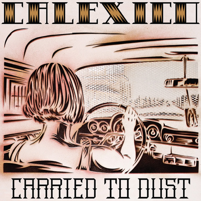
Onto “Carried To Dust”, the extensive artwork you created for this special album is truly breathtaking. The cover itself of a woman driving reminded me originally of a Hitchcock film still (Tippi Hedren’s “The Birds” character or Janet Leigh’s “Psycho” character perhaps), and later I thought of Minutemen’s “Double Nickels On The Dime” album (which would have influenced Calexico). It wasn’t until much later I found out it was in fact Joey’s wife, Nova. I also love the addition of the religious icon hanging from the rear view mirror, it ties back to your earliest work with Calexico. I would love if you could talk about both the front and back covers for “Carried To Dust” (including the wonderful “Blow Up Guy”) and the process involved in their realization?
VG: The cover idea I remember came from Joey and he was wanting something kind of very “Double Nickels”. John owns a 60s VW bug like the one Mike Watt was driving so Joey took some pictures of Jairo Zavala in the car. Jairo was recording and playing with them at the time. I think Joey wanted something “Double Nickels” but different because he sent me some pictures from outside the car and it’s side view. The car was parked, and they looked very posed and not very interesting and not working out. We went back and forth a few times and finally I told him let’s do it all the way but with Nova driving his Impala down the main street, straight up “Double Nickels”. He took a lot of pictures, and the idea was so good, and Nova looked so cool driving that car that it just worked out. It was an homage to the minutemen and Mike Watt who we both know and admire. The Virgin Mary air deodorizer was just there and worked out perfect. Sometimes things just work out naturally; everything being organic. When you do an homage like that, it’s like when you do a portrait. A portrait is not the real thing, so I think it has to be super deluxe to make up for that fact.
When I started working on that project, Joey and John wanted the feel of my earlier stencils. So I tried to make them simple with each image only requiring a couple of stencils. Joey had seen the movie “Blow Up” which I had not seen until just recently, and he was wanting that kind of mood. I made sketches and e-mailed them to him, and he and John would be like, “yes, no, how about this?” and I started making those images. The Blow Up guy came about from images I have done where people’s heads are missing or cut off. If you take a simple image and change something like taking a person’s head off it becomes more interesting. That’s the thinking behind the guy with a pin in his teeth because it makes you think, what is that, what’s going on? The girl with the angel wings is Mexican actress Silvia Pinal in a photo still from “The Exterminating Angel” by Luis Buñuel. Years ago, I bought a video of the movie at a swap meet. I bought the video for a couple of bucks purely for the picture of her on the box. I didn’t realize I had seen the movie when I was a kid. Anyway, I would normally not mention all that because it’s not important for my purposes. I’m not making a portrait of an actress in a famous movie, I’m using the image for the visceral feeling I can get out of it. But I do not mind the association and connection, I like that too. It also becomes part of the work. I added the wings behind her. I made a lot more images that did not get used. Joey kept pushing for more images and I did the best I could.
The very last question, if every sleeve in music was a blank canvas, which album (from any period in time) would you love most to illustrate and why?
VG: That’s a really funny question and I have known of art shows with that as a theme. I have never been asked to be in one but I am pretty sure I would choose not to participate. I have designed dozens of album covers most of which were just putting stuff together for other artists at SST. In that time, I realized that a great looking album cover could never save the bad music inside. But any art style will be legitimized by a great album, in fact if the record is really big it will create a trend in that style. When I think of my favorite albums, to me the covers are what they look like and that’s it. I think of the music and the cover as together and that’s the way it is. It’s like asking someone if you could change the face of the first person you ever kissed what would you do? I just feel like what’s the point.