 Why Stencil Typography Is Here To Stay
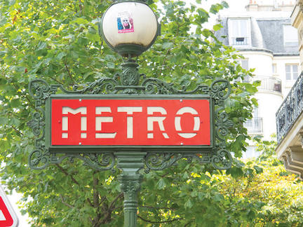
(from fastcodedesign.com; photo by Louise Fili)
DESIGNERS LOUISE FILI AND STEVEN HELLER COMPILE 60 YEARS OF STENCIL TYPE FROM 8 COUNTRIES AND REVEAL WHY THE PRIMITIVE STYLE STILL REIGNS.
The stencil is one of the world’s most primitive printing techniques. It dates back to prehistory, with stencils found in caves, in the art of ancient China and Japan, and in the crafts of indigenous people worldwide. Stencil typefaces are still popular today, whether in the form of new, witty takes on the genre, like Der Weiner Stentzel’s sausage shapes for letterforms, or vintage typefaces redrawn as stencils, like Bodoni or Century.
Stencil Type, a new book by design gurus Steven Heller and Louise Fili, compiles 60 years of this universal typographic style with photos from around the world. It reveals why the stencil has been and remains such a valuable tool for designers and typographers even in the age of digital printing.
Compared to other forms of typesetting, stenciling has always been a low-cost, easy-to-use medium for bold, clearly legible mass communication. This made it ubiquitous in the military and transportation industry (think of the stenciled labels on shipping containers and burlap bags); in populist and rebellious movements (in occupied France, the stenciled letter "V" for victoire became a powerful symbol of resistance; much of the Occupy movement’s poster art is stenciled); and in magazine and poster design, especially in the Bauhaus, Futurist, Constructivist, and Art Deco movements.
By virtue of its cut-out design, stencil type is often more legible than non-stenciled type. (Designers like Paul Rand and Josef Albers were big fans.) As Albers, who designed Schablonenschrift (stencil typeface) for ads in 1926, put it, "The legibility of the most commonly used typefaces decreases with distance. The stencil typeface increases legibility at a distance." The secret to the stencil’s legibility? It’s made up of basic geometric shapes: squares, triangles, and quarter-circles. "The unprinted portions do not remain simply blank," Albers said, "but rather become active negatives, just as empty spaces are structured positively in architecture and sculpture."
All of this means the primitive stencil still holds sway with some of today’s top designers. As typographer Jeff Levine says in the book’s introduction, the stencil's appeal lies in "the look and feel of vintage imperfection." Type star Philippe Apeloig adds, "When the letters are stencil, they seem to be cut out of the paper. They give a kind of visual illusion, something like transparency, as if it will be possible to see through the letter shapes."
Click the slide show above for stencil type eye candy, from the Art Deco signage of the Paris Metro to vintage Orange Crush soda labels.
Stencil Type is available from Thames & Hudson here for $30.